
HarmonyOS 组件封装:从入门到实践
📖 目录
什么是组件封装?
在HarmonyOS应用开发中,组件封装就像是给常用的UI元素穿上一件"外套",让它们更容易重复使用。想象一下,如果你在多个页面都需要使用相同样式的按钮,与其每次都重新写一遍样式代码,不如把这个按钮封装成一个组件,需要的时候直接拿来用就行了。
🎯 核心概念
- 封装:将相关的代码和样式打包在一起
- 复用:一次编写,多处使用
- 维护:统一修改,全局生效
为什么需要组件封装?
🚀 提升开发效率
假设你正在开发一个电商应用,需要在多个页面使用"加入购物车"按钮。如果不封装:
// 页面A
Button('加入购物车')
  .fontSize(16)
  .fontColor(Color.White)
  .backgroundColor('#FF6B35')
  .borderRadius(8)

// 页面B
Button('加入购物车')
  .fontSize(16)
  .fontColor(Color.White)
  .backgroundColor('#FF6B35')
  .borderRadius(8)

// 页面C... 重复代码如果封装了组件:
// 各个页面只需要
ShoppingCartButton()🛠️ 便于维护
当产品经理说"把所有购物车按钮的颜色改成蓝色"时,封装的组件只需要改一处,而不封装的代码需要改N处。
🎨 保持一致性
团队协作时,封装的组件确保所有人使用的UI元素都是统一的,避免了"这个按钮怎么和别的不一样"的问题。
三种主要封装方式
HarmonyOS提供了三种主要的组件封装方式,每种都有其适用场景:
1. 🔧 公用组件封装
适用场景:需要统一样式的基础组件
举例:所有页面的主要按钮都要用相同的颜色、字体、圆角
2. 💬 弹窗组件封装
适用场景:各种自定义弹窗
举例:确认删除弹窗、信息提示弹窗、自定义表单弹窗
3. 🏭 组件工厂类封装
适用场景:需要根据参数动态创建不同组件
举例:根据数据类型显示不同的表单控件(文本框、下拉框、单选框等)
公用组件封装详解
🤔 传统方式的问题
让我们先看看传统封装方式的问题。假设我们要封装一个自定义按钮:
// ❌ 传统方式 - 问题很多
@Component
struct MyButton {
  text: string = ''
  fontSize: number = 16
  fontColor: ResourceColor = Color.White
  backgroundColor: ResourceColor = Color.Blue
  // ... 需要穷举所有Button属性

  build() {
    Button(this.text)
      .fontSize(this.fontSize)
      .fontColor(this.fontColor)
      .backgroundColor(this.backgroundColor)
      // ... 需要设置所有属性
  }
}问题分析:
- 参数爆炸:Button有几十个属性,都要在MyButton中定义一遍
- 使用不便:不能像原生Button那样链式调用
- 维护困难:Button更新了新属性,MyButton也要跟着改
✅ AttributeModifier 解决方案
HarmonyOS提供了AttributeModifier来优雅地解决这个问题:
方案一:提供封装好的组件
适用场景:组合多个系统组件(如图片+文字)
// 提供方:封装图片文字组合组件
@Component
export struct CustomImageText {
  @Prop imageModifier: AttributeModifier<ImageAttribute> = new ImageModifier()
  @Prop textModifier: AttributeModifier<TextAttribute> = new TextModifier()
  @Prop imageSrc: ResourceStr = ''
  @Prop text: string = ''

  build() {
    Column() {
      Image(this.imageSrc)
        .attributeModifier(this.imageModifier)

      Text(this.text)
        .attributeModifier(this.textModifier)
    }
  }
}

// 使用方:创建修饰器类
class MyImageModifier implements AttributeModifier<ImageAttribute> {
  applyNormalAttribute(instance: ImageAttribute): void {
    instance.width(100)
           .height(100)
           .borderRadius(8)
  }
}

class MyTextModifier implements AttributeModifier<TextAttribute> {
  applyNormalAttribute(instance: TextAttribute): void {
    instance.fontSize(14)
           .fontColor(Color.Gray)
           .textAlign(TextAlign.Center)
  }
}

// 使用组件
CustomImageText({
  imageSrc: $r('app.media.icon'),
  text: '商品名称',
  imageModifier: new MyImageModifier(),
  textModifier: new MyTextModifier()
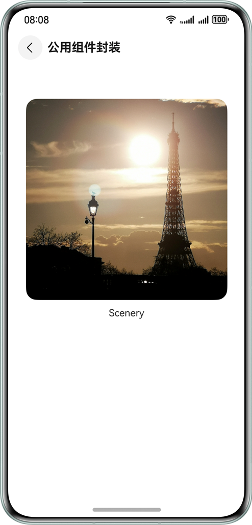
})效果展示:
方案二:提供修饰器类
适用场景:单一组件的样式统一(如按钮、文本)
// 提供方:创建按钮修饰器
export class PrimaryButtonModifier implements AttributeModifier<ButtonAttribute> {
  applyNormalAttribute(instance: ButtonAttribute): void {
    instance.fontSize(16)
           .fontColor(Color.White)
           .backgroundColor('#007AFF')
           .borderRadius(8)
           .padding({ left: 20, right: 20, top: 10, bottom: 10 })
  }
}

// 使用方:直接使用
Button('确认')
  .attributeModifier(new PrimaryButtonModifier())

Button('取消')
  .attributeModifier(new PrimaryButtonModifier())
.backgroundColor(Color.Gray) // 还可以继续链式调用覆盖样式🎯 选择建议
- 单一组件(Button、Text等)→ 选择方案二
- 组合组件(图片+文字、头像+昵称等)→ 选择方案一
弹窗组件封装实战
📱 应用场景
在实际开发中,我们经常需要各种弹窗:
- 确认删除弹窗
- 信息提示弹窗
- 自定义表单弹窗
- 图片预览弹窗
🔧 实现原理
使用UIContext中的PromptAction对象来管理弹窗的显示和隐藏:
// 核心流程
1. 获取 PromptAction 对象
2. 创建 ComponentContent 定义弹窗内容
3. 调用 openCustomDialog 显示弹窗
4. 调用 closeCustomDialog 关闭弹窗💻 完整实现
第一步:创建弹窗内容
import { ComponentContent } from '@kit.ArkUI'

// 使用方:定义弹窗结构
@Builder
function CustomDialogBuilder() {
  Column() {
    Text('确认删除')
      .fontSize(18)
      .fontWeight(FontWeight.Bold)
      .margin({ bottom: 16 })
    Text('删除后无法恢复,确定要删除吗?')
      .fontSize(14)
      .fontColor(Color.Gray)
      .margin({ bottom: 24 })
    Row() {
      Button('取消')
        .backgroundColor(Color.Gray)
        .onClick(() => {
          DialogUtils.closeDialog()
        })
      Blank()
      Button('确认删除')
        .backgroundColor(Color.Red)
        .onClick(() => {
          // 执行删除逻辑
          console.log('执行删除')
          DialogUtils.closeDialog()
        })
    }
    .width('100%')
  }
  .padding(24)
  .backgroundColor(Color.White)
  .borderRadius(12)
}第二步:封装弹窗工具类
// 提供方:弹窗工具类
export class DialogUtils {
  private static dialogId: ComponentContent<Object> | null = null
  private static uiContext: UIContext | null = null

  // 显示弹窗
  static showDialog(builder: WrappedBuilder<[]>, uiContext: UIContext) {
    DialogUtils.uiContext = uiContext
    try {
      // 获取 PromptAction 对象
      const promptAction = DialogUtils.uiContext.getPromptAction()

      // 创建弹窗内容
      DialogUtils.dialogId = new ComponentContent(DialogUtils.uiContext, builder)

      // 显示弹窗
      promptAction.openCustomDialog(DialogUtils.dialogId, {
        alignment: DialogAlignment.Center,
        // backgroundColor: 'rgba(0,0,0,0.5)',
        // cornerRadius: 12
      })
    } catch (error) {
      console.error('显示弹窗失败:', error)
    }
  }

  // 关闭弹窗
  static closeDialog() {
    try {
      if (DialogUtils.dialogId) {
        const promptAction = DialogUtils.uiContext!.getPromptAction()
        promptAction.closeCustomDialog(DialogUtils.dialogId)
        DialogUtils.dialogId = null
      }
    } catch (error) {
      console.error('关闭弹窗失败:', error)
    }
  }
}第三步:使用弹窗
@Entry
@Component
struct HomePage {
  build() {
    Column() {
      Button('显示删除确认弹窗')
        .onClick(() => {
          // 显示弹窗
          DialogUtils.showDialog(
            wrapBuilder(CustomDialogBuilder),
            this.getUIContext()
          )
        })
    }
  }
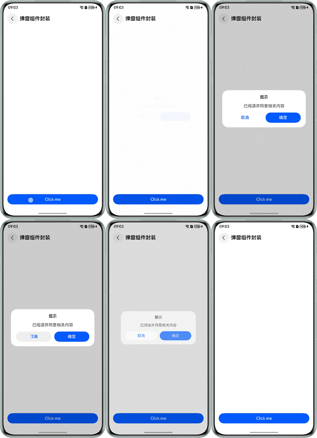
}效果展示:
🎨 进阶用法
你还可以创建更通用的弹窗:
// 通用确认弹窗
static showConfirmDialog(
  title: string,
  message: string,
  onConfirm: () => void,
  uiContext: UIContext
) {
  @Builder
  function ConfirmDialogBuilder() {
    Column() {
      Text(title).fontSize(18).fontWeight(FontWeight.Bold)
      Text(message).fontSize(14).fontColor(Color.Gray)

      Row() {
        Button('取消').onClick(() => DialogUtils.closeDialog(uiContext))
        Button('确认').onClick(() => {
          onConfirm()
          DialogUtils.closeDialog(uiContext)
        })
      }
    }.padding(24)
  }

  this.showDialog(wrapBuilder(ConfirmDialogBuilder), uiContext)
}组件工厂类封装进阶
🏭 什么是组件工厂?
组件工厂就像一个"组件生产车间",你告诉它你要什么类型的组件,它就给你生产出来。这在动态UI场景中特别有用。
📋 应用场景
想象你在开发一个表单生成器,根据配置数据动态生成不同的表单控件:
[
  { "type": "input", "label": "姓名", "placeholder": "请输入姓名" },
  { "type": "radio", "label": "性别", "options": ["男", "女"] },
  { "type": "checkbox", "label": "爱好", "options": ["读书", "运动", "音乐"] }
]🔧 实现原理
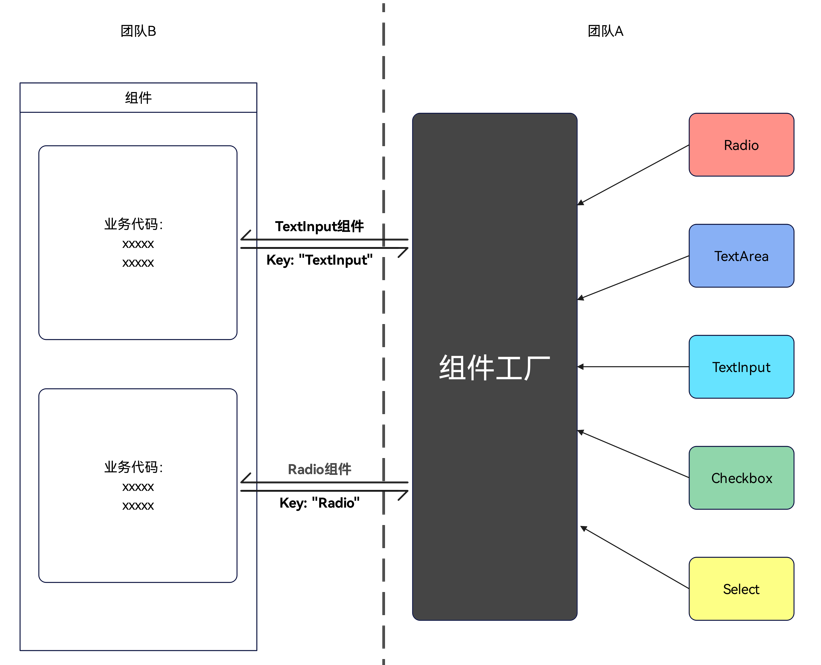
使用Map结构存储组件,@Builder装饰器创建组件,wrapBuilder函数包装组件:
组件名(key) → WrappedBuilder对象(value) → 实际组件💻 完整实现
第一步:创建各种组件
// 提供方:定义各种表单组件

// 文本输入框组件
@Builder
function InputBuilder() {
  TextInput({ placeholder: '请输入内容' })
    .width('100%')
    .height(40)
    .borderRadius(4)
    .border({ width: 1, color: Color.Gray })
}

// 单选框组件
@Builder
function RadioBuilder() {
  Row() {
    Radio({ value: 'option1', group: 'radioGroup' })
      .checked(false)
    Text('选项1').margin({ left: 8 })

    Radio({ value: 'option2', group: 'radioGroup' })
      .checked(false)
      .margin({ left: 20 })
    Text('选项2').margin({ left: 8 })
  }
}

// 复选框组件
@Builder
function CheckboxBuilder() {
  Column() {
    Row() {
      Checkbox().select(false)
      Text('选项A').margin({ left: 8 })
    }.margin({ bottom: 8 })

    Row() {
      Checkbox().select(false)
      Text('选项B').margin({ left: 8 })
    }
  }
}

// 按钮组件
@Builder
function ButtonBuilder() {
  Button('提交')
    .width('100%')
    .height(44)
    .backgroundColor('#007AFF')
    .borderRadius(4)
}第二步:创建组件工厂
// 提供方:组件工厂类
export class ComponentFactory {
  private static componentMap: Map<string, WrappedBuilder<[]>> = new Map([
    ['input', wrapBuilder(InputBuilder)],
    ['radio', wrapBuilder(RadioBuilder)],
    ['checkbox', wrapBuilder(CheckboxBuilder)],
    ['button', wrapBuilder(ButtonBuilder)]
  ])

  // 获取组件
  static getComponent(componentType: string): WrappedBuilder<[]> | undefined {
    return this.componentMap.get(componentType)
  }

  // 获取所有可用组件类型
  static getAvailableTypes(): string[] {
    return Array.from(this.componentMap.keys())
  }

  // 注册新组件
  static registerComponent(type: string, builder: WrappedBuilder<[]>) {
    this.componentMap.set(type, builder)
  }
}第三步:使用组件工厂
// 使用方:动态表单页面
@Entry
@Component
struct DynamicFormPage {
  @State formConfig: Array<{type: string, label: string}> = [
    { type: 'input', label: '姓名' },
    { type: 'radio', label: '性别' },
    { type: 'checkbox', label: '爱好' },
    { type: 'button', label: '' }
  ]

  build() {
    Column() {
      Text('动态表单示例')
        .fontSize(20)
        .fontWeight(FontWeight.Bold)
        .margin({ bottom: 20 })

      // 动态生成表单项
      ForEach(this.formConfig, (item: {type: string, label: string}) => {
        Column() {
          if (item.label) {
            Text(item.label)
              .fontSize(16)
              .alignSelf(ItemAlign.Start)
              .margin({ bottom: 8 })
          }

          // 🎯 关键代码:从工厂获取组件
          this.buildComponent(item.type)
        }
        .width('100%')
        .margin({ bottom: 16 })
      })
    }
    .padding(20)
    .width('100%')
    .height('100%')
  }

  @Builder
  buildComponent(componentType: string) {
    const component = ComponentFactory.getComponent(componentType)
    if (component) {
      component.builder()
    } else {
      Text(`未知组件类型: ${componentType}`)
        .fontColor(Color.Red)
    }
  }
}效果展示:
🚀 进阶技巧
1. 带参数的组件工厂
// 支持参数的组件
@Builder
function ParameterInputBuilder(config: {placeholder: string, maxLength: number}) {
  TextInput({ placeholder: config.placeholder })
    .maxLength(config.maxLength)
    .width('100%')
}

// 工厂方法支持参数
static getComponentWithParams(
  componentType: string,
  params: any
): WrappedBuilder<[any]> | undefined {
  // 根据类型和参数返回对应组件
}2. 组件注册机制
// 支持运行时注册新组件
ComponentFactory.registerComponent('custom-input', wrapBuilder(CustomInputBuilder))⚠️ 注意事项
- wrapBuilder限制:只支持全局@Builder方法
- 使用限制:WrappedBuilder的builder方法只能在struct内部使用
- 性能考虑:避免在循环中频繁创建WrappedBuilder对象
最佳实践建议
🎯 选择合适的封装方式
| 场景 | 推荐方案 | 理由 |
|---|---|---|
| 统一按钮样式 | AttributeModifier方案二 | 简单直接,保持链式调用 |
| 卡片组件(图片+文字) | AttributeModifier方案一 | 组合多个组件 |
| 各种弹窗 | PromptAction封装 | 统一管理,易于维护 |
| 动态表单 | 组件工厂 | 根据数据动态生成 |
📝 命名规范
// ✅ 好的命名
PrimaryButtonModifier     // 主要按钮修饰器
ConfirmDialogBuilder      // 确认弹窗构建器
FormComponentFactory      // 表单组件工厂

// ❌ 不好的命名
Modifier1                 // 不知道是什么
Dialog                    // 太泛化
Factory // 不知道生产什么🗂️ 文件组织
src/
├── components/           # 组件目录
│   ├── common/          # 公用组件
│   │   ├── modifiers/   # 修饰器
│   │   ├── dialogs/     # 弹窗
│   │   └── factories/   # 工厂
│   └── business/        # 业务组件
└── utils/               # 工具类
└── DialogUtils.ets # 弹窗工具🔄 版本管理
// 为组件添加版本信息
export class PrimaryButtonModifier {
  static readonly VERSION = '1.0.0'

  applyNormalAttribute(instance: ButtonAttribute): void {
    // 实现代码
  }
}📚 文档注释
/**
 * 主要按钮修饰器
 * @description 用于统一应用中主要按钮的样式
 * @example
 * Button('确认')
 *   .attributeModifier(new PrimaryButtonModifier())
 * @version 1.0.0
 * @author 张三
 */
export class PrimaryButtonModifier implements AttributeModifier<ButtonAttribute> {
  // 实现代码
}常见问题解答
❓ Q1: AttributeModifier和传统封装有什么区别?
A1: 主要区别在于使用方式和灵活性:
// 传统方式
MyButton({ text: '确认', fontSize: 16, color: Color.Blue })

// AttributeModifier方式
Button('确认')
  .attributeModifier(new PrimaryButtonModifier())
.fontSize(18) // 还可以继续链式调用AttributeModifier保持了原生组件的链式调用特性,更加灵活。
❓ Q2: 什么时候使用组件工厂?
A2: 当你需要根据数据动态决定显示什么组件时:
// 适合用工厂的场景
const formItems = [
  { type: 'input', label: '姓名' },
  { type: 'select', label: '城市' },
  { type: 'date', label: '生日' }
]

// 不适合用工厂的场景
// 固定的UI布局,不需要动态变化❓ Q3: 弹窗封装后如何传递数据?
A3: 可以通过闭包或者全局状态管理:
// 方式1:闭包传递
static showEditDialog(userData: UserData, onSave: (data: UserData) => void) {
  @Builder
  function EditDialogBuilder() {
    // 可以访问userData和onSave
  }

  this.showDialog(wrapBuilder(EditDialogBuilder), uiContext)
}

// 方式2:全局状态
@Observed
class DialogState {
  userData: UserData = new UserData()
}❓ Q4: 组件封装会影响性能吗?
A4: 合理的封装不会显著影响性能,反而有助于优化:
// ✅ 好的做法:复用组件实例
class ButtonModifierPool {
  private static instance = new PrimaryButtonModifier()

  static getInstance() {
    return this.instance
  }
}

// ❌ 避免:频繁创建新实例
Button('确认')
.attributeModifier(new PrimaryButtonModifier()) // 每次都创建新实例❓ Q5: 如何处理组件的主题切换?
A5: 可以在修饰器中根据主题状态动态设置样式:
export class ThemeButtonModifier implements AttributeModifier<ButtonAttribute> {
  applyNormalAttribute(instance: ButtonAttribute): void {
    const isDarkMode = AppStorage.get('isDarkMode') || false

    instance.fontSize(16)
           .fontColor(isDarkMode ? Color.White : Color.Black)
           .backgroundColor(isDarkMode ? '#333333' : '#FFFFFF')
  }
}总结
通过本文的学习,你应该已经掌握了HarmonyOS中三种主要的组件封装方式:
- 公用组件封装:使用AttributeModifier优雅地扩展系统组件
- 弹窗组件封装:使用PromptAction统一管理各种弹窗
- 组件工厂封装:使用Map和@Builder实现动态组件生成
🎯 关键要点
- 选择合适的方案:根据具体场景选择最适合的封装方式
- 保持一致性:统一的命名规范和代码风格
- 注重复用:一次封装,多处使用
- 便于维护:良好的文档和版本管理
🚀 下一步
- 尝试在你的项目中应用这些封装技巧
- 建立团队的组件库规范
- 探索更多高级封装模式
希望这篇文章能帮助你更好地理解和应用HarmonyOS的组件封装技术!如果有任何问题,欢迎在评论区讨论。